Few years ago, me and two friends decided to enter into the startup adventure with one thing in mind: create the babysitting revolution...
2 of us, me included, were fathers loving to party. The problem was that finding a good available babysitter in town was a nightmare. Find another in case the first one isn't free is hell. Then comes to the payment. You don't have cash and have to withdrawn on your way back. Then comes to the calculation - 3h and 22min x 8.5€ - after way too much beers... Fuck! Icing on the cake, you have to drive her back. Damn! I'm sure you know what I'm talking about.
The Moonkey concept was born. Create and Uber-like app to connect Parents who want to escape their duties for few hours, to nearby trusted Babysitters as well as be able to pay them by credit card. Sounds promising, right? By the time we started the project, no one had the same offer. We rapidly found out that many others had the same idea than us, which comfort us in the idea that there's a need for such service.
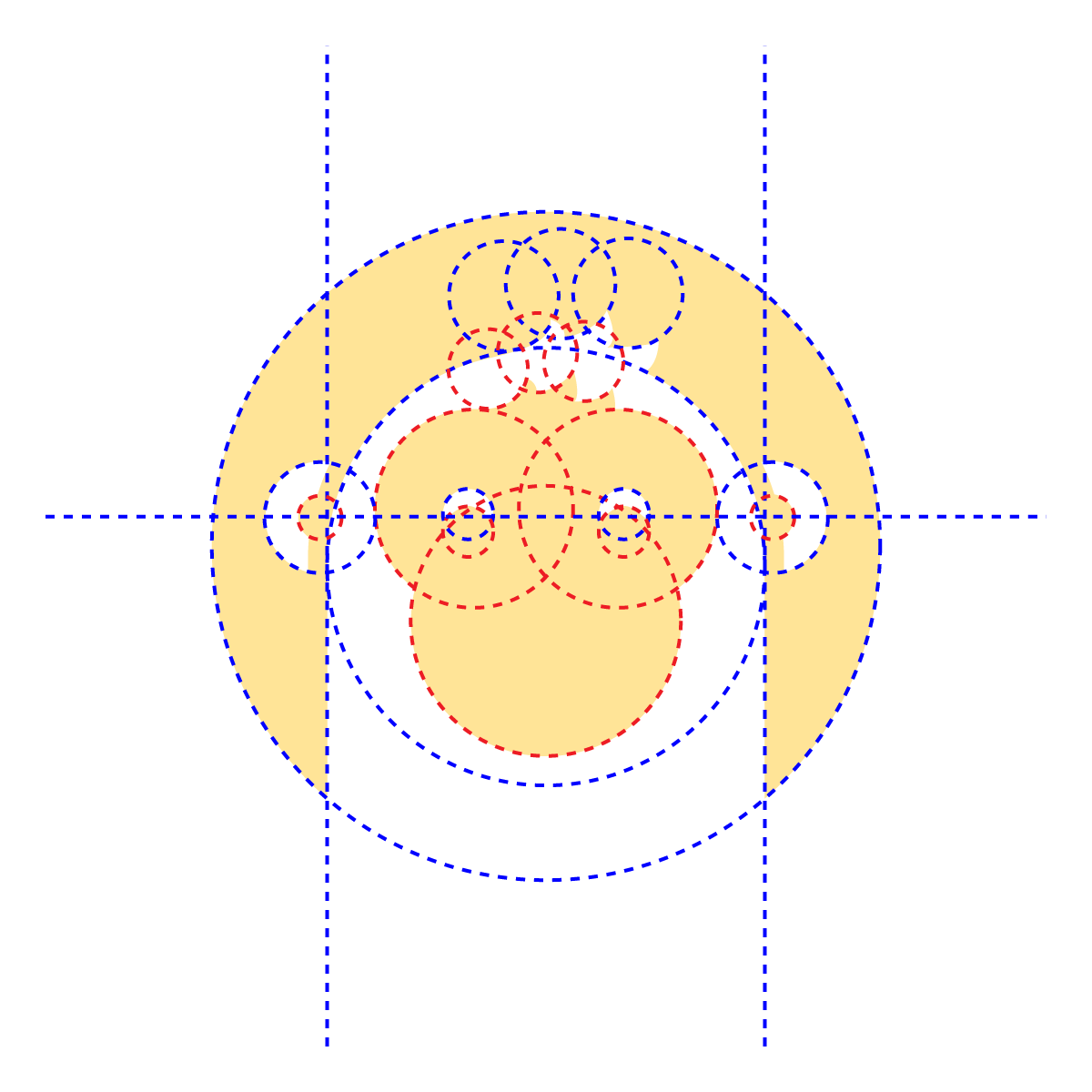
Why "Moonkey"? Cracking after a few sleepless nights? Random choice? No no no, none of that. It is the result of a thoughtful and long-term work. Moonkey is actually a contraction of two words "Moon" + "Key". Moon is the star of the night, whose symbolism is traditionally linked to the maternal ideal. Key allows you to open what is closed, what is hidden or to push a door that prevents you from moving forward.
These two words perfectly define our concept. On the one hand, to offer parents the key to having their children looked after at night, in complete serenity. On the other hand, offer the Babysitters the key to make ends meet by caring for children from trusted families. The Moonkey contraction then forms the word "Monkey", a social and maternal animal. Moonkey was born then, and we loved it.
Of course, we wanted Moonkey to be different from our competitors. While everyone was using soft, cute and maternal color codes, with photos of babies etc. We at Moonkey, have approached the babysitting from a new angle. Not the babysitting itself, but what it allows you to do: Have good time, go out, have fun, enjoy some time without kids. That being decided, we've chosen a flashy and warm color code, and based our communication on illustrations that would give a very unique perception to our brand, our application and our product. We wanted our users to feel being part of a good community, to be part of something special. We wanted them to love our product.


During a babysitting, you leave what matters the most to you, to someone you don't know: your kids, and your house. Trust was the key!
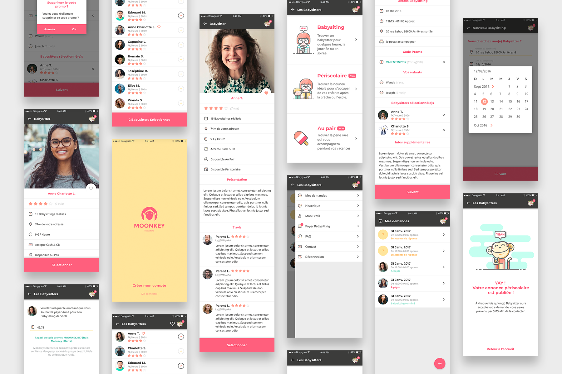
Starting from this, we wanted our users to feel trust while they were using the app. To do so, we had to pay attention to tiny details that would make a big difference in the user journey and the perception. Of course no bugs, whether its a design bug, or a technical one, our app must be bug free. Profile pictures were mandatory. Both Babysitters and Parents must feel that there are humans behind the app, humans with who they are going to interact with, exchange money with, etc...
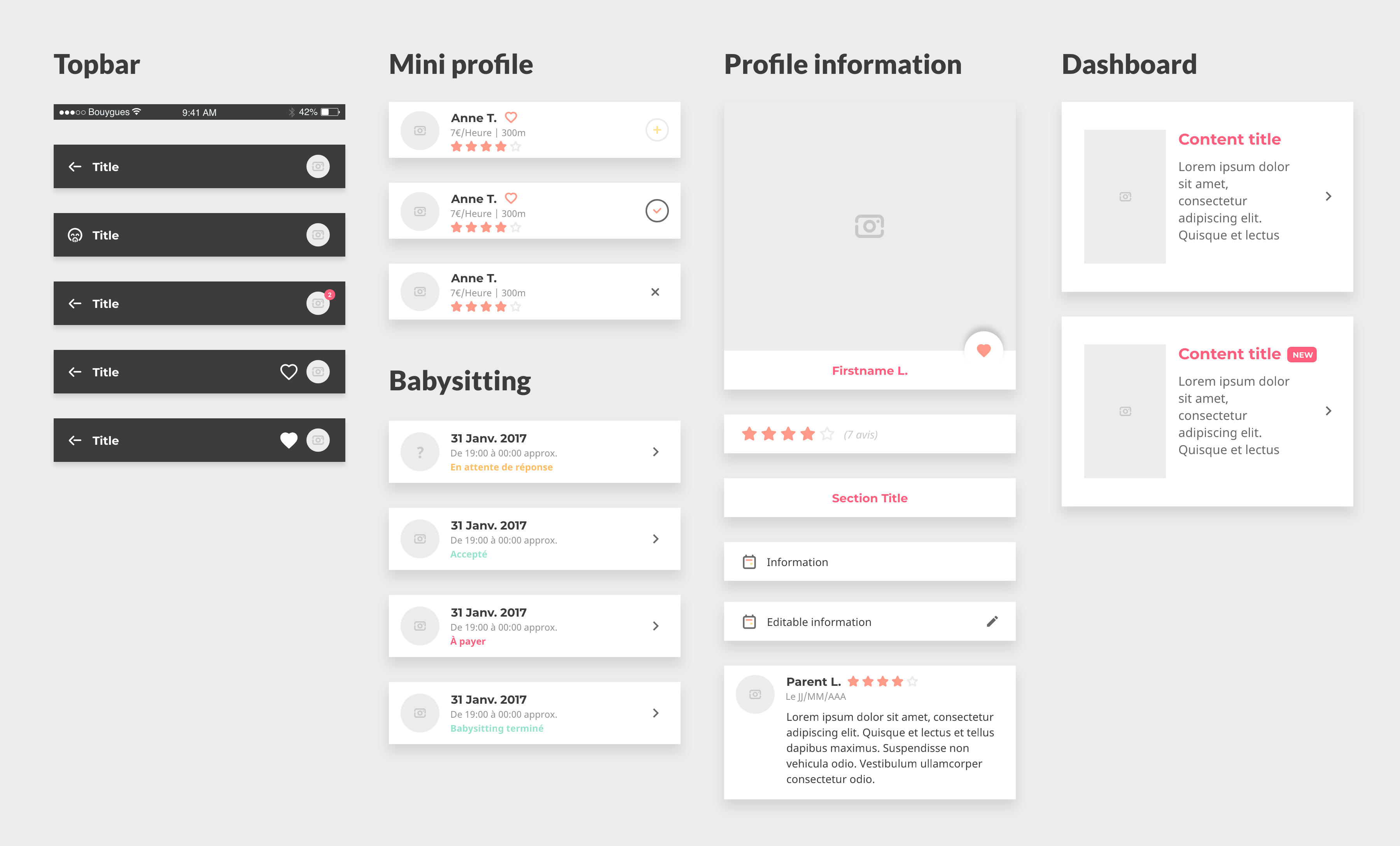
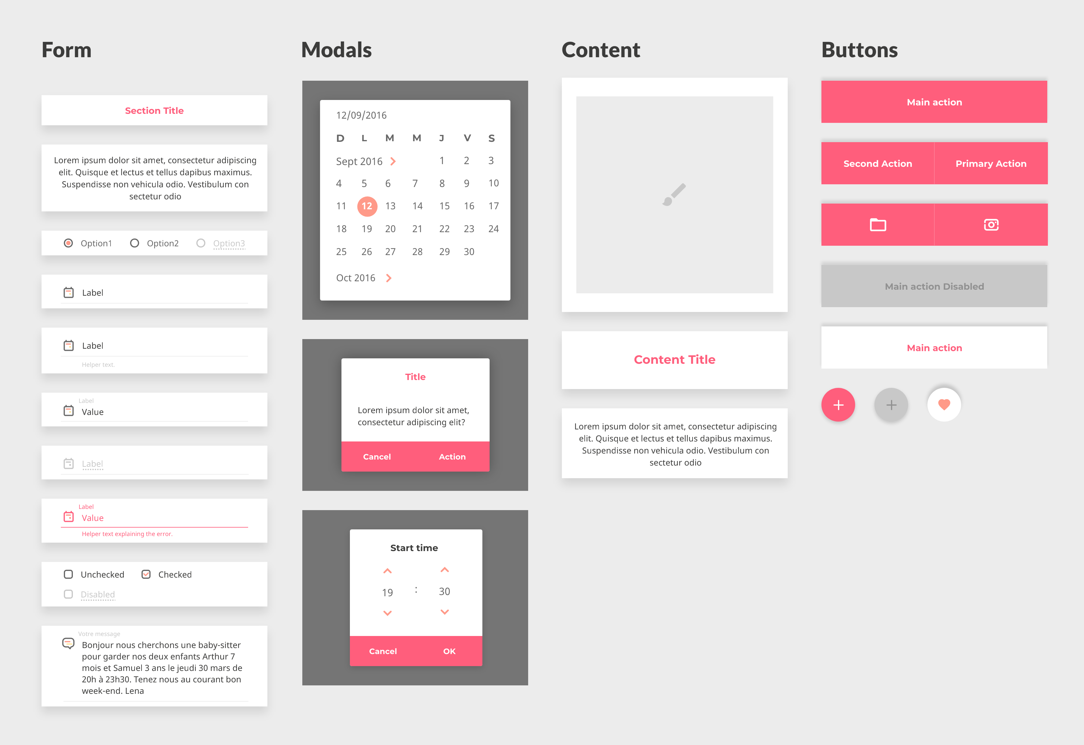
From a seamless booking, to a secure payment we managed to meet our quality goal by working with a design system approach. Our app was build using components that were used as bricks we can combine to build each view of the app.This helped us to scale fast as well as stay consistent across the app.

